Inspired by M.G. Siegler's
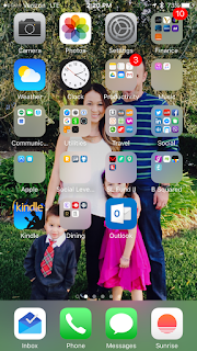
, I took a look at my iPhone home screen. And the disappointment of clear and apparent disorganization immediately set in. For a time I was a bit OCD in maintaining a clean layout. Then as time wore on and my collection of apps continued to grow, I became obsessed with putting like apps into their respective folders. I still had about four pages of icons to go through, not including the folders and so I ultimately resolved to search whenever I wanted to open any application. Once search became my prevalent mechanism for finding content, my iPhone organization went out the window and I was left with this:

You can see the folder addiction I had, but actually opening anything quickly by clicking through is extremely unlikely; it was all about search for me. The picture is a bit dated as well, from December 2014.
I decided to start fresh and cleared out all the apps, moving them to secondary screens. And then I started adding things back in that I actually seem to be using. It's been a week or so, and I like where this is headed. Search is awesome for finding apps that I use once a week or once a month, but it's so much easier to just click from the homescreen to the apps I use on a daily basis. Here's the new look, along with a new picture of the family (also changed this week), from November 2015:

Starting from the top, the first two apps help me in the morning. Although I don't come close to day trading, I still have an urge to check the markets at least a couple of times throughout the day.
is my default watch list, partially in deference to my partner
, and in part because they actually do a great job of surfacing commentary and sentiment around the stocks I'm following, which is just as important as the news around them. Interestingly, StockTwits just released
that enables real time quotes inside of Slack. The second app is just the weather. Living in San Francisco means that weather changes are expected when you cross the street, but I still like to get a general sense of what I should expect when I wake up.
The next two apps are the camera and
. As a parent of two young kids, fast access to the camera is essential. And I have a preference for Google Photos over the standard Photos app for numerous reasons including the ability to sync across devices - including deletions.
In the second row, I have Google for all things search (my 6 year old is always asking me things that I have to look up!), FB and Twitter for social (I know, I'm old school for not having SnapChat, WeChat - even FB Messenger!) and Yelp which is still incredibly helpful, at least in San Francisco.
In the third row I have my fitness apps coupled with music. Spotify and Nike Running definitely go together nicely. It might be a bit said for me to have Fitbit there, but now that I've
committed to at least 70k weekly steps and a minimum of 8k daily steps
, I need to check my progress from time to time!
The fourth row is mostly around transportation. I usually walk from meeting to meeting, but as I find myself in new areas of the city often enough, a quick review of where I'm heading on Google Maps is helpful. And Uber is there to help when a walk just isn't the thing to do. Although I have Safari on this row as well, it's actually the one app I haven't opened directly.
The bottom row is for my business communications. Email has been my default ahead of phone for many years and Google's
is now my favorite interface (on the web and on mobile alike). Phone and SMS are standard and my current calendaring app is
, which I've been very happy with for the past few months.
I still have two more rows to fill up, but I'm now much more selective with the apps that get to live on the home screen. It will be interesting for me to see how my layout changes over time.